nymph
A branding project born from personal interest, Nymph reimagines the traditional fashion doll by putting self-expression at the center. Designed as a direct competitor to Barbie, Nymph empowers users to create dolls that reflect their own identity or aspirations—merging the creativity of doll customization with the accessibility of a ready-made brand.
date
2024
service(s)
brand identity and graphic design
client
school project / personal
challenge
As part of the Branding Specialisation, we were tasked with creating a complete brand concept based on a personal interest. The brand had to function as a competitor to an existing, real-world brand. We had full creative freedom in terms of theme and direction, but were required to develop the full visual identity—logos, assets, and graphics—ensuring the brand felt cohesive, functional, and market-ready.
solution
I created nymph, a brand designed to rival Barbie by offering a more personal and inclusive experience. Nymph allows customers to design their own customizable doll—reflecting either how they see themselves or how they aspire to look. The goal is to give individuals the freedom to create a representation of themselves, inspired by the creativity of doll customizers, but without the complexity or effort. Nymph celebrates individuality, identity, and self-expression in a way that feels accessible and empowering.

01
visual identity
colors
The visual identity of Nymph is intentionally playful and vibrant. I chose a bold, eclectic color palette—colors that might not traditionally work well on their own, but together create a dynamic and expressive narrative. This combination reflects the brand’s focus on individuality and creativity. The typography follows the same spirit: fun, approachable, and full of personality, reinforcing the sense of freedom and self-expression that Nymph stands for.
typography

colors

02
visual design
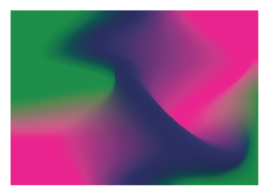
gradients
Beyond just bold colors, Nymph’s visual language uses vibrant gradients built from six distinct hues. While each color might feel unconventional on its own, together they create a cohesive and expressive palette that tells a story. These gradients are layered with a subtle grain filter, adding texture and a nostalgic, handcrafted feel—tying back to the brand’s roots in personalization and creative expression.


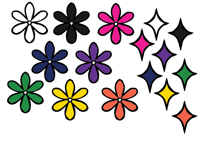
graphics
The graphic elements evoke a playful, retro aesthetic with strong Y2K influences. From textures to bold, nostalgic shapes, the visuals are designed to feel fun, expressive, and slightly over-the-top—capturing the early 2000s spirit while reinforcing Nymph’s identity as a vibrant, youthful brand.


logo
The primary logo features a butterfly symbol paired with a bold, playful typeface. The butterfly represents transformation, individuality, and self-expression—core themes of the Nymph brand. The strong typography balances the softness of the mark, creating a dynamic contrast that reflects both empowerment and creativity.


03
what did i learn?
Creative Freedom Can Be a Challenge
Having full control over the brand concept was exciting, but it also came with its own set of challenges. Without strict guidelines, I had to define my own creative boundaries and make sure every decision aligned with the brand's identity and message.
Balance Between Playfulness and Functionality
Working with such vibrant visuals and a playful tone taught me how to keep things exciting without compromising usability. I learned how to use bold design elements in a way that still felt cohesive, intentional, and functional across different touchpoints.
Telling a Story Through Design
This project reinforced the importance of storytelling in branding. From color choices to logo symbolism and graphic style, I learned how to make design decisions that communicate deeper meanings and connect emotionally with the audience.